Wednesday, April 29, 2020

Pre-Somewhere Post


(1) For the image that I thought would be somewhat difficult for me to photoshop myself into was this photo of the Jenner/Kardashian clan. The challenge would be not removing anyone and only adding to the picture. With that challenge in mind, I think I would try and expand the style of the photograph and incorporate similar clothing and makeup with myself and maybe others to create a balance when adding to the picture. It would be a long process, but an interesting challenge in both beauty and skill.


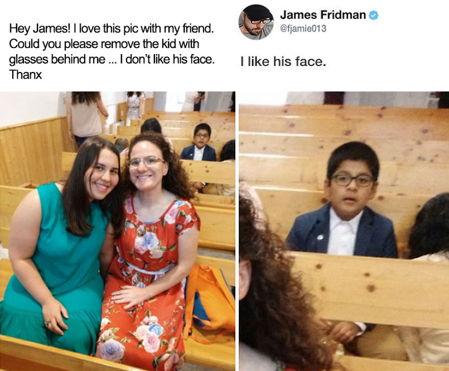
(2) For an image of inspiration, I really wanted to do a scene that most people have seen or know of. With images or scenes that are in the public eye for a long time and hold a reputation of being a classic or famous, when people photoshop themselves into these type of scenes, they seem to be funnier, relatable and things people understand because it is part of popular culture. 


(3) This image really made me laugh because it hardly had anything to do with photoshop which took me by surprise. With the thought of photoshop, people expect to get rid of the "ugly" things, yet I think with a funny message like this, there comes the thought of the negative side of photoshop. People do not think about the ethics of "deleting ugly" or something "unwanted." Which I think is the subtle message this artist has when creating these posts.


(4) I would really like to recreate this type of illusion. I always look for fun ways to create different images and this one looks simple enough for me to do with my friends. I think that the perspectives in camera work is really important and this really inspires me to use reflections and glass more often.


Logos

Sketches and brainstorming of different logos for this                 The logo that was chosen:
project:


My final pieces:


This project was a fun one and it took me about 7 hours to make from the sketches to the actual pieces that I created. This was created using illustrator and he most difficult part for me was picking the different palettes or color schemes for my logo. When combining colors, I would think that the combination would turn out, but I end up picking a whole different pallet at the end. I think my most accomplished moment in the process was when a whole color scheme looked awful and I ended up picking a darker tone; this is how the teal and pink color combination came to be.
My inspiration for the final  logo was taking elements in my life that I found important and put them together to symbolize myself. The moon in the top right of the triangle is to cover my spirituality and shyness I tend to first have when meeting new people. The drips at the bottom cover my struggle with anxiety while the circle in the middle is representing a sun that shining through the darkness and its rays bursting out of the triangle. The blank point in the top left is made to represent the experiences I take in the past (why it points "backwards"), and use it to make my present and unwritten future brighter which is why it is left blank. All of this combined is to mark my constant three points of myself that I always take with me.

Monday, April 27, 2020

Business Cards


Logo(s)


     This project was really fun and took me about 3 hours to do. I went off of the sketches I had drawn prior to doing these business cards, but made sure to heighten the details as well as polish the graphics and text that I use.
     Something that I wanted to do was take elements of my logo and use those details to expand the design and to make the business cards cohesive throughout their formats. The main elements that I used were the moon and drips to make my business cards feel fun, but also spiritual. When it comes to business cards, I always thought of it as part of a first impression and I really wanted to make the cards stand out and the colors that I picked before were a good route to go even before this project.

SOMEWHERE

             Final Project


               Pieces and inspiration used to create this cover


This project took me about 5 hours to make. My largest difficulty came because I did not want to expand layout, rather I deleted someone and added myself into the photo. It became harder as I went along because the blank spot that occurred had rough patches, so it was hard for me really hide the markings and make a clean background. Adding myself in, however, was the easiest and funnest part to me, I think. Overall, I am satisfied, but know I can do a better job.
I was inspired by bumping into old headshots of myself and realizing how my poses were of "Disney form." I went straight into High School Musical as that was a pretty big part of my childhood as me and my mom would stay up to see the new ones come out. It was something that I was able to fulfill about 15 years later, so I think my child-self would be proud.


Saturday, April 11, 2020

Autoscopy Assignment

Original Photo:

 
                                                                           Extra Pieces Used:


Inspiration for Assignment:


                       Final Piece:


Statement: 

     This assignment took me about five to six hours to do. The difficult part was rearranging the layers of each piece as well as positioning the pieces themselves in a way that I liked. It was interesting for me to make the pieces coming out of my leg and face a different hue that make the art really stand out. Something that I really tried to do was make parts of the image otherworldly, yet still somewhat familiar.
     When trying to find inspiration this assignment I was  struggling to think of something that I would like to do. I knew I wanted to make an image seem mystical, but like it was actually part of the reality that we live in today. I was listening to music when Shawn Mendes came on and relooking at his album cover, I thought that this would be a really cool idea to take inspiration from. By finding my concept I was able to find the image I want as well as the new world I wanted to create.

Friday, March 27, 2020

Tag Brush

Original Logo


 Tag Brush Logo
Final Product 
        This assignment was really fun and simple enough to do. My logo was something I made that really brought out multiple angles on who I am and adding these styles on top enhanced it more. It took me about a couple hours to do. The hardest part was reading the directions as carefully as I can and making sure I don't miss a step. I had issues finding different presets, but after some patience I was able to locate everything I needed to and finish the project. 
       During this interesting and confusing time in quarantine, I found myself listening to music I either haven't listened to in a long time or finding new music to me. I always admired classic rock and have been really getting into its groove and artistry. I wanted to pick colors that gave the feel of this classic rock or vintage nostalgia. I experimented with the placement as well as the size to my liking in order to emulate my inspiration. Playing with angles got too messy for my liking and the feel as well as the original logo became way too lost with everything. I'm really satisfied with what I was able to do with my logo.

Wednesday, March 18, 2020

Propoganda Poster


The Final Piece 


Self portrait inspiration

Propaganda inspiration piece 


          When given this assignment, I wanted to make a fun bandwagon propaganda poster that still held a message of something that people should think about more. I was able to find it when browsing images of myself and realized how many pictures I have wearing glasses. This became my inspiration for my poster. When doing the Self-Portrait portion of the assignment, I had a lot of difficulty when it came to my hair. The most difficult part was finding the texture that I thought was close to my image and still blended with the minimalistic idea I wanted. The self portrait portion took me about six hours to finish. 
          When it came down to the text and the actual poster, I wanted to do something fun and bright to highlight my message of wearing sunglasses to prevent damage to someone's eyes from the sun. I wanted bright orange and yellow colors for this. After the "text assignment" I knew I wanted to include some sort of image, in this case, of a sun. I found an image that I thought suited the picture, traced it and incorporated the words I wanted into the sun's image. This portion took me an hour, including brainstorming and research.